Thursday, June 10, 2004
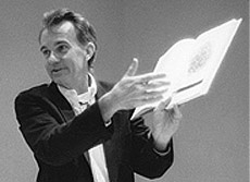
Edward Tufte, professor emeritus of statistics and design at Yale, has published a cogent exposition on the corruption of PowerPoint. a short version of which was published as an editorial in Wired. Tufte's critique, among others, was the basis of a New York Time article daftly entitled "Power point makes you stupid", which gave rather short shrift to the Tufte's philosophical concerns. Those can be found, clearly and lively put, in his three beautifully published monographs, well worth owning, on the grammer and philosophy of visual communications: The Visual Display of Quantitative Information, Envisioning Information, and Visual Explanations.
 It is not surprising, if oft overlooked, that the words and definitions we chose to use, unconsciously or intentional, are never neutral; they will colour our meaning, will hinder as well as aid both in our own perception and understanding, and in that of our audience. Francis Bacon and George Orwell warned us as much. In his essays, the prevalence of dichotomous modes of thinking and classification was one of Stephen Jay Gould's favorite themes; because it is impossible to fully comprehend phenomena of any complexity, Gould suggests, that we necessarily resort to a partial representations, whose selection is to a greater or lesser degree, culturally & personally (æsthetically) influenced. This is reflected in the fundamental dichotomy of representational painting and photography; it is easy to say "this is a photograph of a pepper" but it is impossible to conflate the photograph with the pepper itself — you certainly can't eat the photograph. It is difficult to say what a "natural" perspective or point view should be, or that such a privileged vantage even exists; everything depends on what we want to see or hide.
 In his monographs, Tufte brings to visual communications the same skepticism towards communicative neutrality Edward Sapir and Ben Whorf, most famously, brought to linguistics. In this aspect, they can be particularly useful and edifying to a student in the sciences. The process of displaying data on a graph seems as if it should be immune to subjectivity, after all, "the numbers do not lie". But every scientist, who has to deal with data analysis on a daily basis, knows that it is perfectly possible to plot data in such a way as to be maximally friendly to our expectations, and to minimise that which we not do not like, all without broaching the letters of proper ethics. Less sinisterly, depending on how we plot it, can reveal important features otherwise easily overlooked, or render remarkable data dull or even meaningless. In Visual Explanations, Tufte provides two case-studies, John Snow's (1813-1858) cholera map of 1854, and the 1987 space shuttle Challenger disaster, on the objectivity of data and its possibilities and limitations .
The importance of all this, in the final analysis, is that classification and categorisation are important, and taxonomy cannot be denigrated as mere "stamp collecting"; how we perceive and understand the world in strongly influenced by the words and images, and by the mental categories we have in our minds that we invoke, when we talk about it. This is not an extreme cultural-relativist argument that objective facts do not exist and objective understanding impossible; rather, accurate and objective understandings are necessarily composed of many partial, subjectively influenced views. Thus to disavow at the first any pretensions to complete objectivity, and to be aware that subjective influence is pervasive and unavoidable, must be the first duties of anyone who wants to understand the world. This is especially important for a scientist.
It is not surprising, if oft overlooked, that the words and definitions we chose to use, unconsciously or intentional, are never neutral; they will colour our meaning, will hinder as well as aid both in our own perception and understanding, and in that of our audience. Francis Bacon and George Orwell warned us as much. In his essays, the prevalence of dichotomous modes of thinking and classification was one of Stephen Jay Gould's favorite themes; because it is impossible to fully comprehend phenomena of any complexity, Gould suggests, that we necessarily resort to a partial representations, whose selection is to a greater or lesser degree, culturally & personally (æsthetically) influenced. This is reflected in the fundamental dichotomy of representational painting and photography; it is easy to say "this is a photograph of a pepper" but it is impossible to conflate the photograph with the pepper itself — you certainly can't eat the photograph. It is difficult to say what a "natural" perspective or point view should be, or that such a privileged vantage even exists; everything depends on what we want to see or hide. In his monographs, Tufte brings to visual communications the same skepticism towards communicative neutrality Edward Sapir and Ben Whorf, most famously, brought to linguistics. In this aspect, they can be particularly useful and edifying to a student in the sciences. The process of displaying data on a graph seems as if it should be immune to subjectivity, after all, "the numbers do not lie". But every scientist, who has to deal with data analysis on a daily basis, knows that it is perfectly possible to plot data in such a way as to be maximally friendly to our expectations, and to minimise that which we not do not like, all without broaching the letters of proper ethics. Less sinisterly, depending on how we plot it, can reveal important features otherwise easily overlooked, or render remarkable data dull or even meaningless. In Visual Explanations, Tufte provides two case-studies, John Snow's (1813-1858) cholera map of 1854, and the 1987 space shuttle Challenger disaster, on the objectivity of data and its possibilities and limitations .The importance of all this, in the final analysis, is that classification and categorisation are important, and taxonomy cannot be denigrated as mere "stamp collecting"; how we perceive and understand the world in strongly influenced by the words and images, and by the mental categories we have in our minds that we invoke, when we talk about it. This is not an extreme cultural-relativist argument that objective facts do not exist and objective understanding impossible; rather, accurate and objective understandings are necessarily composed of many partial, subjectively influenced views. Thus to disavow at the first any pretensions to complete objectivity, and to be aware that subjective influence is pervasive and unavoidable, must be the first duties of anyone who wants to understand the world. This is especially important for a scientist.
post a comment